Websites are misunderstood. Most websites are nothing more than an online business card or at best an online brochure. It is imperative that you make your website standout, connect with your visitors and capture more leads. Here are 5 hacks to making a fitness website that can have a direct impact on your business.
Hack #1: Develop a market-match opt-in.
One of the main points of a website is to grow an email list. That means that someone visits a website and fills in a form in exchange for something they want. This is called the free offer. The free offer must provide a specific solution to a specific problem experienced by a specific segment of people. It must be something the website visitor actually wants and it must connect with them emotionally. No one wakes up in the morning wishing they had another free report. No one wants a 5-day video series. No one wants a newsletter. They want one of their main problems solved.
An example target market is active older adults. The free offer should be something that immediately helps this target market with one of their pain points. Here’s an example: aging seniors tend to wake up and feel stiff and achy. They’re frustrated that they’re in pain every morning. A website done correctly would offer a free opt-in that solves this problem (see Hack #3 for headline examples).
When this concept is followed, your conversion rates will increase.
Hack #2: A simple home page is best.
Here’s something that most webmasters will not share – a flashy and intricate design doesn’t really matter! A website must look professional, but it does not need to have flashy color palettes, custom designed graphics, or lots of stuff filling the page. This is how most webmasters make their money. They do a lot of stuff, but this stuff doesn’t convert to leads or make any real difference in the lives of a website visitor.
Does a website visitor care that the website they’re on has a slider gallery? Not at all. In fact, if that gallery offers no value to them then it’s nothing more than clutter.
What has been shown to work over and over again is simplicity.
A home page should have a small logo in the top left corner, a basic navigation bar in the top right and a single area on the home page that includes a stellar headline (see Hack #3), on-message copy (see Hack #3), and a market-match offer (see Hack #1).
That’s it. The more polluted the home page is the more people get lost and don’t take the action of opting-in. The more stuff on a home page, the lower the conversion rate.
Hack #3: Headline and copy matter. A lot.
Most fitness websites will look different from one another, but very few of them actually connect. Most are boring and act as nothing more than an online business card. A headline (for a free offer, for a blog post, or for an ad) is critical.
Let’s use achy-back seniors as an example.
Here are three headlines that would work:
· “The 2 simple stretches I give my clients to relieve their achy back muscles in the morning.”
· “Learn how I helped my client, John Doe, relieve his back pain and soreness for good by watching TV.”
· “How I restored my achy back to health without invasive surgery.”
These titles solve a specific problem experienced by a specific group of people. Specificity (also known as niching) is critical for increasing opt-ins and generating sales down the line.
Hack#4 Don't be commonplace.
Hack #3 mentions how most fitness websites have nothing remotely interesting about them. A properly done website will be a living, breathing asset. Fitness business owners can insert personality into their website by adding images of themselves, their staff, their clients or their facility. Stock photos are never recommended because they give no value to the website visitor.
Video is another great way to connect with website visitors, but again it should include the personality or branding from the business. Video is one of the best ways to connect with website visitors that have yet to come into a facility’s door.
People buy from people they know, like and trust. A website should work to promote a connection between the fitness business and the potential client. This is best done by being a real human and connecting with people through stories, images, video and copy.
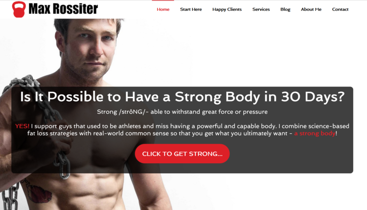
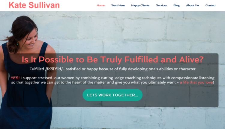
Don’t believe a website can have a personality? Take a look at these two images. They are the same exact layout, but the colors and background image give two distinct vibes.
This one has a hard-core feel to it:

And this one has a softer feel:

Something as simple as a personalized picture, colors and text can make a difference when connecting to a target audience. Fitness businesses should focus on what makes them different from their competition, not the same. One easy way to do this is to be real, talk directly to a target market and insert personality into the website.
Hack #5: Follow-up – master a lost art.
A common problem that many fitness business owners face is that they spend time and/or money driving traffic to a website or landing page; people opt-in; and then nothing. No sales.
As Hack #1 mentions, one of the main reasons to have a website is that it grows a list of interested people. But people don’t immediately look at a website and purchase something, particularly a service like personal training or health coaching. No one immediately buys from every website they like.
When someone opts-in, they are holding up their hand and saying, “I really like what you’re doing and want to know more.” Following up with that interested list on a regular and consistent basis will nurture a relationship over time, and when the interested person is ready to buy, they will naturally think of the business that they’ve come to know, like and trust.
This follow-up process should follow the same hacks already outlined.
· Emails should be simple (black text on white background with one or no images included).
· It should have a great subject line to get people to open it.
· The content should have personality and connect with the audience.
These five simple hacks will lead to increased conversions on any fitness website. Your business will stand out, you will more effectively connect with your visitors and capture more leads and ultimately set your business up for limitless potential.


